Design
Design
Control the look and feel of your Pi-Square link.
The Design screen lets you control the overall look and feel of your link, customize sections of the catalog page, and add static pages related to policies, FAQs, how it works, and other customer-facing information.
Settings
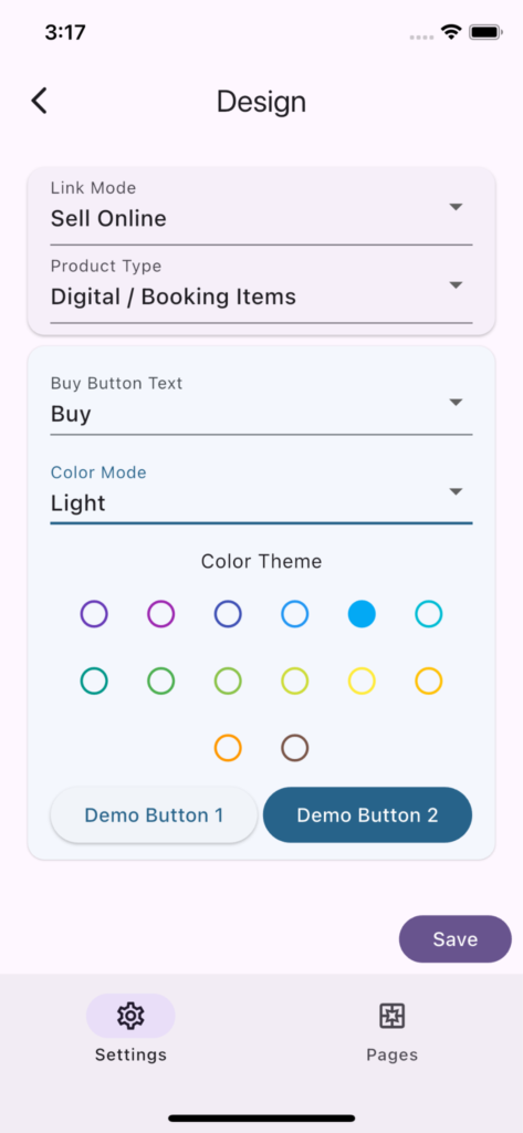
Link Mode and Product Type settings are repeated here from Settings screen for convenience.
Buy Button Text
This text is automatically set from the Product Type. Physical Products and Digital Goods use “Buy”, Bookings and Appointments use “Book”, and Donations use “Donate”.
It is usually better to keep the default. Change it only when your link needs a more specific action such as “Order”, “Reserve”, or “Register”. You can also override the button text for an individual item from the item settings when only one item needs different wording.
Color Mode
Light or Dark mode. Choose one that best represents your store, booking link or service.
Brand Color
Choose the brand color that best represents your store, booking link, or service. You can pick from the preset colors or use More Colors to select a custom color. Pi-Square uses this color to generate the customer-facing theme for buttons, highlights, and related UI elements.
Pages
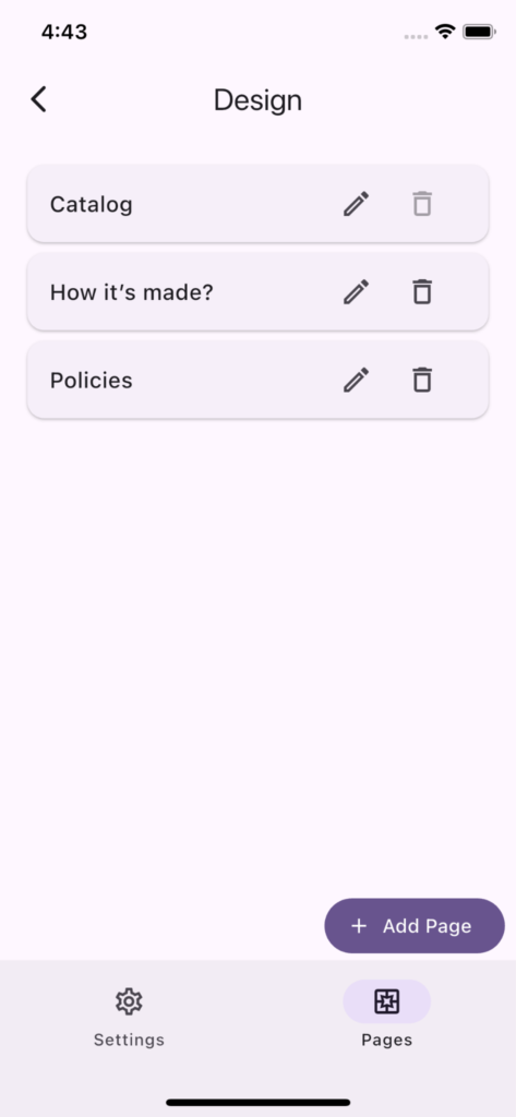
You can manage your pages on this tab.
Catalog Page
This is the default page that is displayed when user opens a link. You can customize the top and bottom section of the catalog page.
You can add page blocks above and below the catalog. Use the top section for the first thing customers should see, such as a hero, banner, or announcement. Use the bottom section for supporting details, testimonials, policies, delivery notes, or trust information.
Other Pages
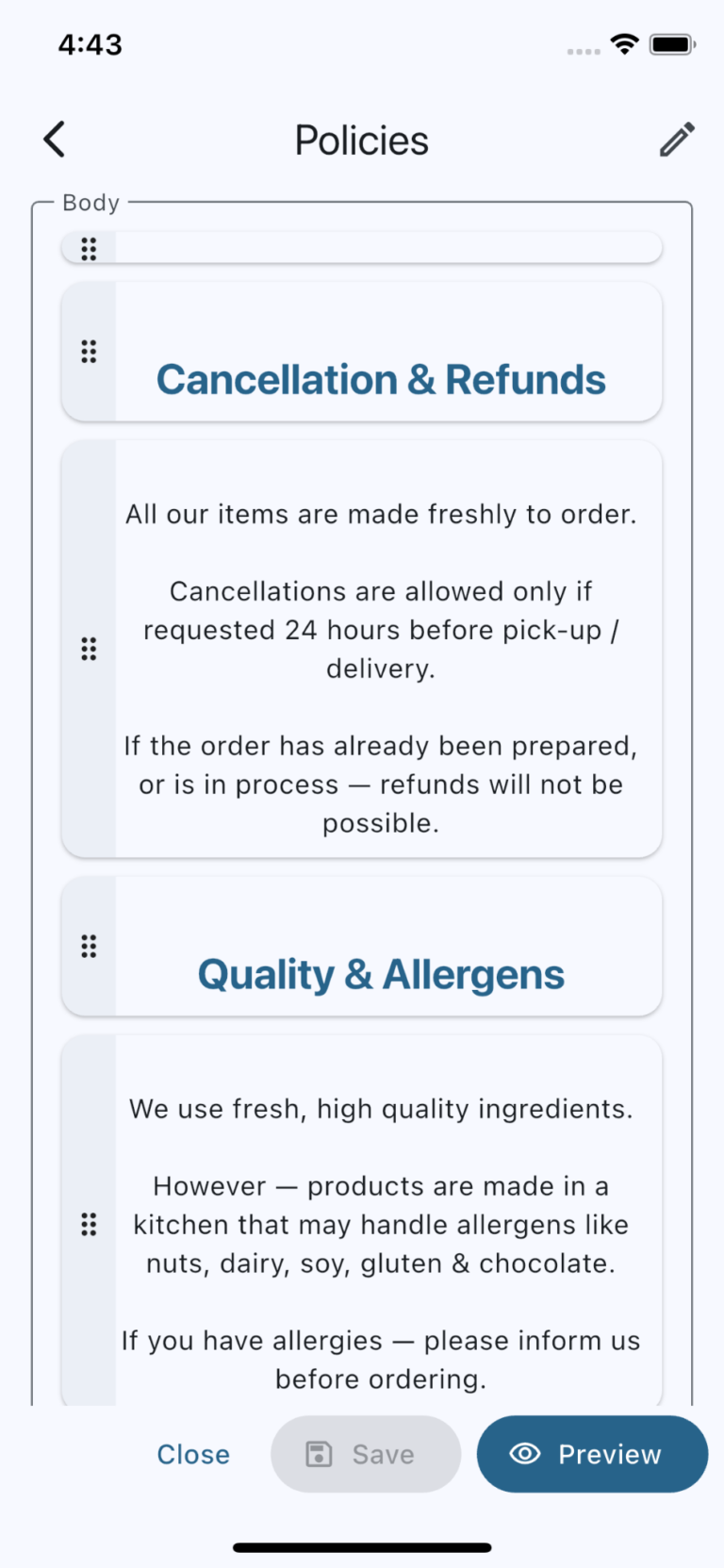
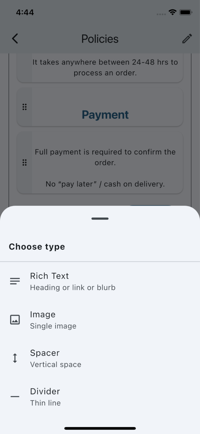
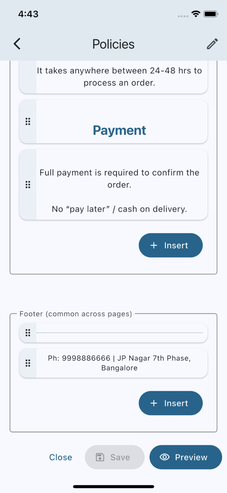
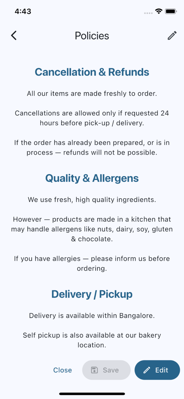
You can create static pages as needed. New pages start with sample image and rich text blocks, and you can replace or rearrange blocks to build the page. The image carousel below shows screenshots of page editing screen.
Footer
You can add a common footer that appears across all pages. Modifying the footer for any page modifies it for all pages.
Page Blocks
Pages and catalog sections are built using blocks. You can add, edit, duplicate, delete, and reorder blocks to create the layout you need.
Rich Text
Use Rich Text for headings, paragraphs, bullet points, links, policy text, FAQs, and other written content. It supports Markdown for common formatting like headings, bold, italic, strikethrough, lists, numbered steps, and links.
Image/Video Banner Carousel
Use Image/Video Banner Carousel for visual banners, product highlights, venue photos, service examples, or short videos. Wide media works best for catalog-top banners because it fills the available horizontal space more naturally.
Hero
Use Hero when you need a stronger first section with a banner image, headline, subtitle, and primary or secondary actions. Hero buttons can link to pages, web URLs, WhatsApp, or other supported destinations.
Text + Image/Video Card Carousel
Use Text + Image/Video Card Carousel for repeated content such as testimonials, featured services, steps, benefits, packages, team members, or event highlights. Each card can include a title, content, and image or video. You can control the card size, padding, image size, image fit, text position, alignment, and rounded corners.
Announcement Strip
Use Announcement Strip for a short scrolling message such as “Free delivery”, “COD available”, “Limited slots”, or other quick customer notices.
Spacer
Use Spacer to add vertical breathing room between blocks.
Divider
Use Divider to separate sections with a thin line.